What is Ring?
Ring is a security video doorbell that stream live HD video and two-way audio straight to your mobile device. If you have notifications turned on on your app, you will receive alerts instantly no matter where you are. You will be able to see and interact with anyone who comes to your door. Whether you live in a safe quiet upper middle-class neighborhood or less desirable crowded urban neighborhood, Ring can and will always put your mind more at ease.
Mission
Ring devices are managed through the Ring app. In the Apple App store, Ring is ranked #14 in the utilities category. However, the app has a relatively lower rating of 3.3 stars. As the nature of an UX/UI Designer, I have a strong desire of wanting to uncover and eliminate the pain points of those using the app. I am challenging myself to create viable solutions to provide its users better experience on the app and improve its overall rating in the future.
My Audit Process
01 Discovery
It’s important to understand the app user’s frustration points. The discovery phase sets the direction and foundation of the redesign.
Hypothesis Creation
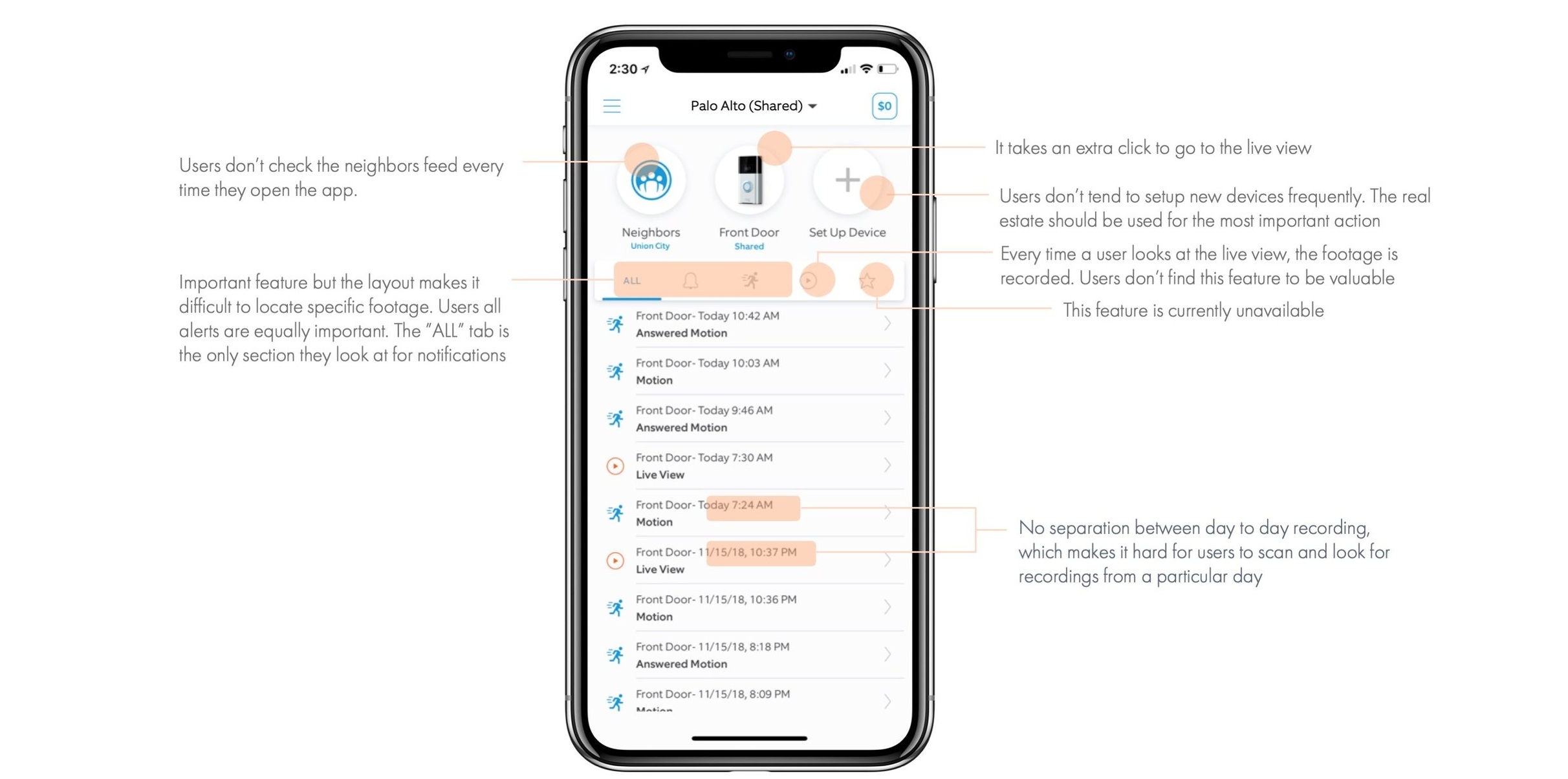
Through the audit process, I tested the app and gave myself some hypothetical scenarios that I had to accomplish. I was able to understand the current flow of the app and managed to identify usability issues and potential user pain points. To validate my assumptions and observations, usability tests and user interviews will be performed.
Usability Tests
My first approach to understanding the users is through emphasizing with their experience by conducting usability tests. This consisted of asking 10 users who have not used Ring before and 10 current Ring users to perform the task and observed their interactions with the app. Usability testing will help uncover things that are difficult to do on the app.
Not Ring Users:
I’ve given a scenario task to the users and observed their user flow on solving the issue.
Scenario: I was at work all day, I received an email at 10AM stating my Amazon package has been delivered and the driver left it on the front porch. I went home and didn’t see any package there. You have the Ring app, how would you track your package using Ring?
2. Ring Users:
I asked the users a question and observed their reactions to my question. I asked some follow up questions to challenge the conversation even more.
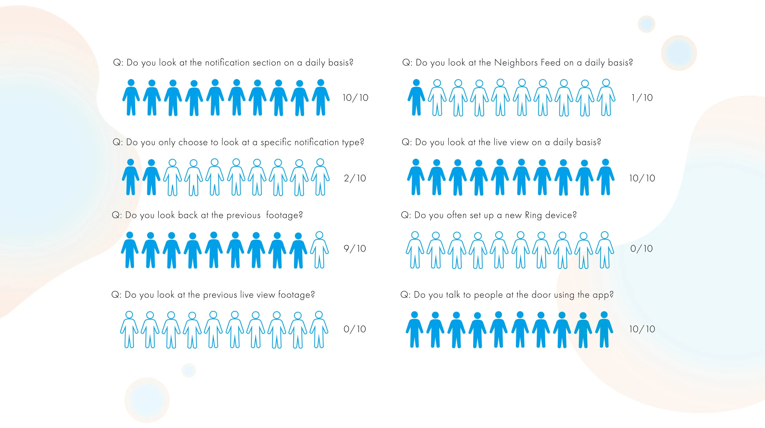
Question: What features do you use the most?
02 Discovery Synthesis
With all the data gathered from the research. I was able to fully understand the needs of the users and synthesize the findings to better define the project scope and problems.
User Personas
User Customer Journey Map
03 Design Iteration
04 Hi-Fi Design Development
05 Design Validation
The redesign was shown to the current Ring users who participated my usability test since the beginning of the UX audit. Unfortunately, I was only able to reconnect with 6 out of the 10 test subject users. I asked each of them to perform the same task – to help me locate a specific footage. The graph below shows significant improvement on performance.


